Pasta Vista
Pasta Vista
FOR
Explore Cuisine
YEAR
2018
WORK
Branding
Logo Design
Copywriting
BRIEF
Re-designing Explore Cuisine’s products by changing the name and look.
RATIONALE
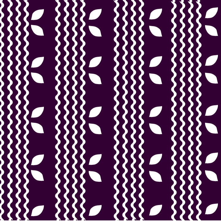
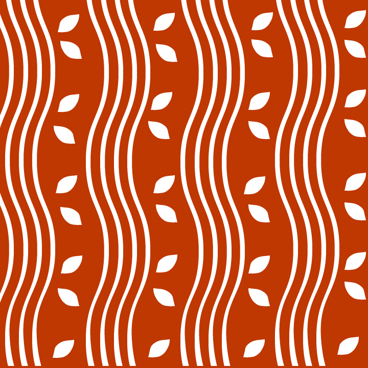
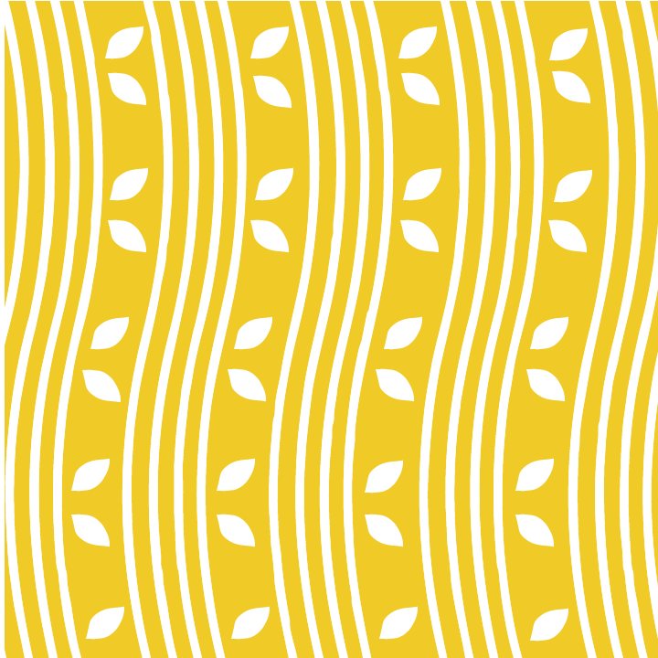
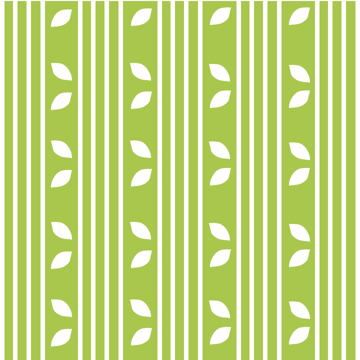
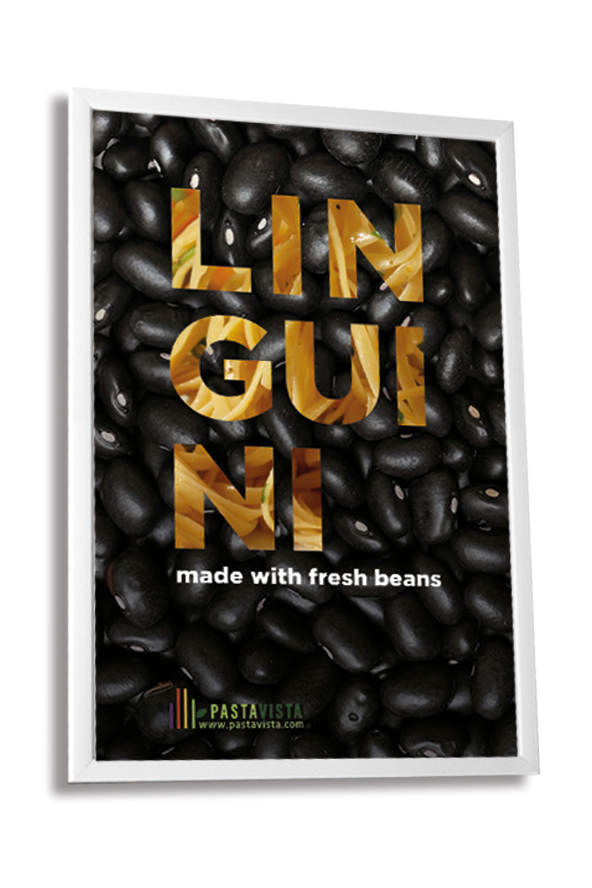
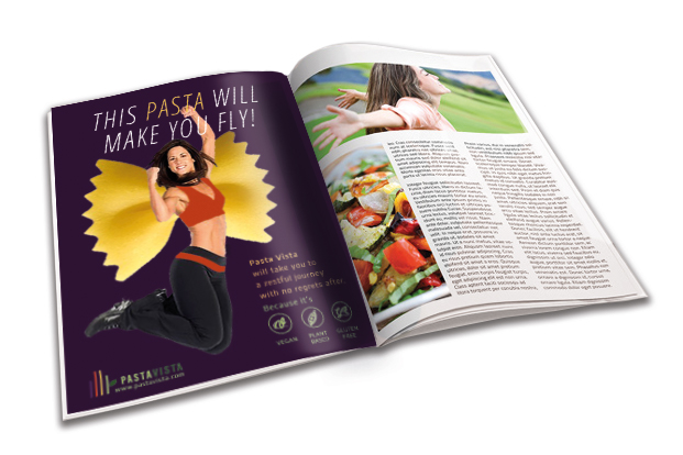
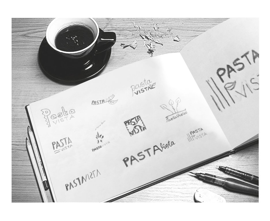
Explore Cuisine begun to transform centering the change insight. Vista which means perspective has been used because their products offer a new idea to consumers, pasta made with plants but exactly tastes like wheat pasta. That’s why visual concept had to be bold and lively as well.
Four stripes in different colors refer various kinds of pasta of the company. Logo and logomark have been adapted to several mediums to give a hint for the new branding.